A logo design requested by a client having a grunge type face.
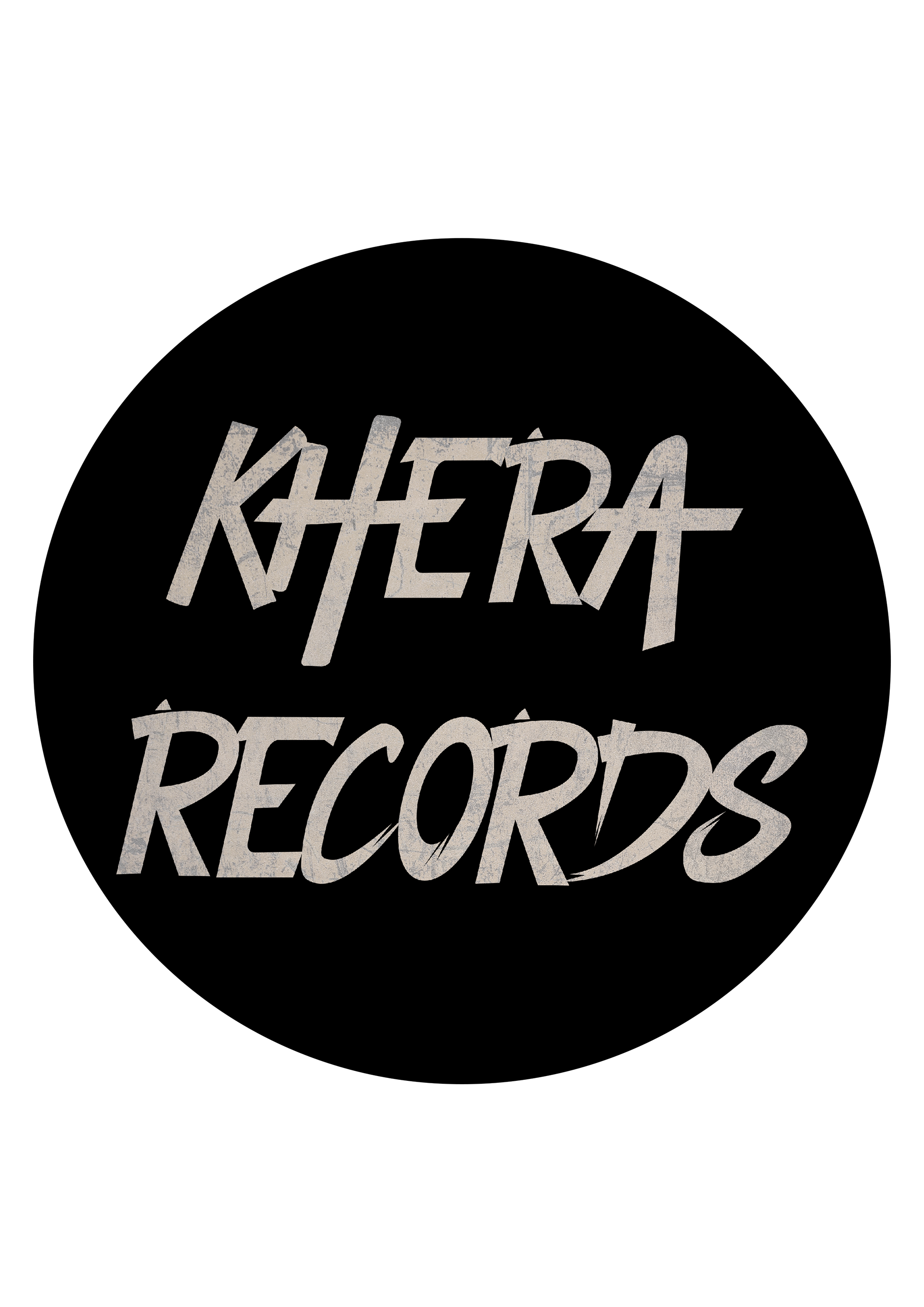
The client requested a font be created based on the images they provided. The font was to fit in with their brand and have a grudge influence.
Initially, creating a mood board on Pinterest was useful, as it helped to generate conversation with the client to pinpoint what they wanted in the font. This research and collaboration with the client narrowed down on ideas and helped to visualise the end product. From here, illustrator was used to explore ideas and form the alphabet in the new font.
This program allowed the font to be changed and manipulated easily and so was the ideal method. To help capture the grunge feel, the text was made italic - this was a significant decision in the final design. Photoshop was experimented with and provided the texture that was needed. Following discussions with the client after showing the progress of the design, flicks were added on to the type to finalise the project.